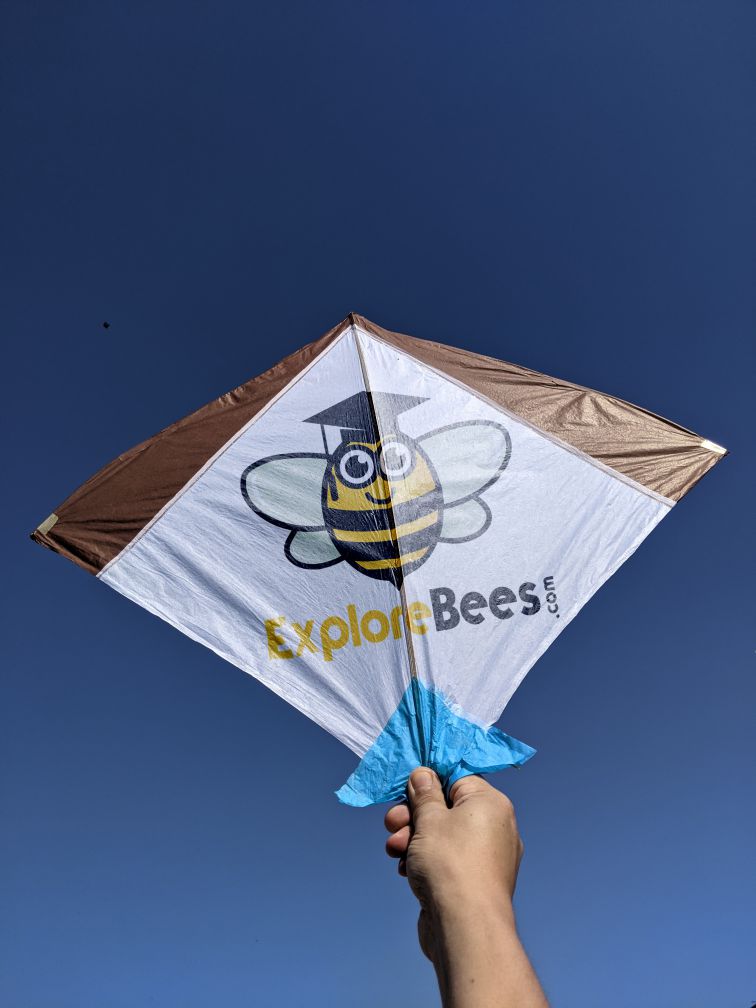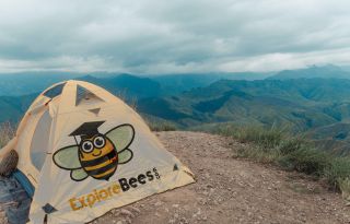


The ExploreBees logo is more than just an image—it’s a reflection of our belief in the transformative power of travel. It captures the essence of exploration, connection, and discovery, encouraging travelers to venture beyond the ordinary and dive into the heart of every destination.
The bright yellow “Explore” radiates the excitement and energy that come with discovering the world’s wonders, while the bold black “Bees” ground the logo in clarity, strength, and trust. Together, they remind us that every step you take with ExploreBees is a step toward adventure, learning, and meaningful connections that will last a lifetime.

To ensure flexibility across different applications, the ExploreBees logo is available in two primary formats: the Primary Logo and the Primary Horizontal Logo.


Our brand is brought to life through a carefully selected color palette that reflects our mission of discovery, adventure, and connection. Below are the core colors that define ExploreBees:
The color of new horizons and exciting adventures. Sunshine Yellow embodies the thrill of exploration and the joy of discovering hidden gems.
Like the night sky over endless landscapes, Midnight Black represents strength, trust, and the depth of every journey.


Ensure the area around the logo remains clear. The space should be at least the height of the uppercase "E" in Explore (x-height), and double that for the bee mark.


We value our brand, and we know you do too. To protect our reputation and maintain consistency, please avoid the following:
No visual effects, rotation, or alterations. Keep the logo intact.
Maintain the original colors, dimensions, and relationships of the logo.
The logo should stand alone, not as part of a tagline or sentence.
Keep the ExploreBees logo separate from other logos or trademarks.
Avoid using ExploreBees branding for materials not affiliated with our brand.
Build unique branding elements for your own materials, rather than modifying ours.


To protect the ExploreBees brand and its assets, it’s important to follow these legal guidelines:
All content produced by ExploreBees, including logos, images, and text, is copyrighted. Do not reproduce or distribute any brand assets without proper authorization.
The ExploreBees brand can only be used for commercial purposes with explicit permission. If you wish to feature the brand in promotional material or commercial campaigns, approval must be obtained.
Any modifications to the logo, name, or other brand elements without permission are strictly prohibited. Always use the brand assets as provided.


Download our full press kit to access our high-resolution logos, vibrant branding images, and captivating videos that tell our story. Whether you're crafting a feature, designing a project, or just curious about who we are, you'll find everything you need right here. Click below to download the press kit:
